Phase one of new website launches Tuesday
February 1, 2011
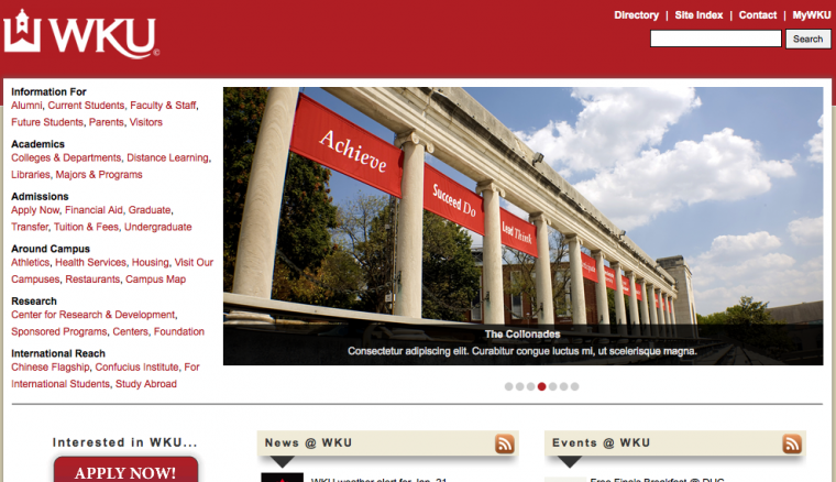
WKU officials hope the university’s new website, which began its three-phase launch today, appeals to prospective students with an easy-to-use design.
Public Affairs and Information Technology teamed up on the redesign, which users can now see on WKU’s homepage and immediate landing pages. The rest will launch in two more phases on July 1 and Sept. 3.
Bob Owen, vice president for Information Technology, said that because the new website is clean, fresh and engaging, it helps communicate the culture of WKU to prospective students.
“It has an element of showing a place that is alive,” he said. “This is a dynamic institution, and I think the website reflects that.”
Corie Martin, manager of Creative Web Services for the Division of Public Affairs, said the redesign process began by examining higher education websites from across the country as well as the existing WKU website.
Robbin Taylor, vice president for Public Affairs, said WKU got a marketing agency to do a mock-up. Then a committee of student, faculty, IT, public affairs, marketing and web services representatives looked at designs.
After looking at several different ideas, Martin said WKU combined the elements that they decided were most important.
“We put it together like you’d put together a puzzle,” she said. “The new design is a combination of all the designs submitted to us. We just pulled everything we liked and put it all in one.”
Stacey Biggs, chief marketing officer for Public Affairs, said one of the most noticeable additions to the home page is a big red “Apply Now” button. Also new is an interactive element with pictures of students, where you can click to learn more about that particular student.
Martin said the new website primarily reaches out to prospective students and their families.
“When you’re looking at colleges, you go to their website first,” she said.
Some of the most popular items potential new students want to see are what academic programs are offered, how much the university costs and what student life is like — all of which Martin said is now easily accessible.
There is also a section for parents that focuses on their interests, such as safety and how to pay the university bill, Martin said.
“Parents want to see that it is the best possible learning and living environment for their children,” she said. “So we made all those things very easy to navigate.”
Because the website was largely designed for the “external community,” Taylor said WKU did focus groups to get the perspective from students and parents looking at WKU from the outside.
Biggs said the new design makes it very obvious that, no matter what page you’re on, you are on a WKU website.
“With the colors we’re using, mostly red, black and gray and always having the WKU logo prominent, it’s very specifically branded,” she said. “There’s no doubt where you are.”
Martin said she hopes the new website design will show people that WKU is a campus that rivals any other major university across the nation. She said the quality of the new design blew her away the first time she saw it put together.
“The design and the staggeringly beautiful photos we have across the website are very impressive,” she said. “I’m very excited to share this with the campus community.”